


How to Build a Cohesive Palette Using Coloured Tiles
Love coloured tiles but not sure how to tie them together? Here’s how to use colour with confidence across your kitchen, bathroom, and beyond.
Coloured tiles are having a moment. From soft sage green tiles and seafoam blue tiles to burnt terracotta, clay pink and even deep navy, colour has returned to our homes in subtle, sophisticated ways.
But using colour well doesn’t mean just picking a tile you love and hoping for the best. It’s about building a palette that feels intentional. One that flows from room to room. One that makes your space feel styled and not scattered.
Here’s how to build a cohesive colour palette using coloured tiles, and make sure everything works together across bathrooms, kitchens, laundries, and living areas.

Black tiles are often overlooked when it comes to tiling a bathroom.
1. Choose a colour direction that reflects how you want your home to feel
Start by thinking about mood, not paint swatches. Do you want your home to feel calm? Energised? Sophisticated? Warm? Cool? Soft greens, muted blues, and warm clay tones create entirely different feelings, and each sends your space in a specific direction. Choosing a “colour direction” early on helps narrow your options and avoid clashing decisions later.
For example:
- Soft, dusty greens work beautifully in bathrooms or kitchens where you want serenity and connection to nature
- Terracotta and warm neutrals suit relaxed, coastal or earthy interiors
- Deep blues or navy work well in formal or moody spaces like powder rooms or feature walls
For more help aligning colour with style, check out Which Tile Style Matches Your Space? It’s a great starting point before choosing your tile tone.

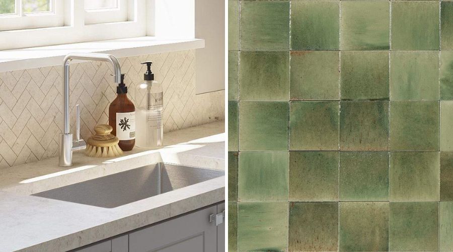
Green tiled splashback exudes serenity in a bathroom!
2. Start with one “hero” tile and build around it
Every good tile palette starts with one strong anchor. That might be a green kit kat splashback in your kitchen, a deep orange penny round wall in the ensuite, or a blue floor tile in your laundry. Whatever it is, this tile will guide your decisions across every other surface.
Once you’ve chosen your hero tile, build the rest of the palette around it using:
- Tonal variations (lighter or darker shades of the same colour)
- Neutral support tiles (think soft whites, warm greys, or beige)
- Textural contrasts (e.g. a honed or matte finish paired with something glossy or sculpted)
3. Limit your colour palette but expand your texture and finish
The key to making colour feel stylish (not scattered) is to limit how many colours you use and expand the way you use them. That means repeating tones across spaces, but varying how you apply them.
Let’s say you love deep green. Rather than using a different colour in every room, you might:
- Use a glossy green tile in your kitchen splashback
- Choose a matte or honed green feature tile in your powder room
- Pair it with brushed brass tapware or accessories to echo the warmth of the palette
This way, each space feels distinct, but the home still feels cohesive. If you're pairing bold tiles with tapware or basins, Buildmat’s kitchen mixer taps and bathroom basins are sorted by finish, so you can find tones that complement your tile choices easily.

These Vetra Giada Green Gloss would work beautifully as a kitchen or bathroom splashback.
4. Carry your palette across multiple spaces in different ways
One of the easiest ways to create flow in your home is to repeat tile colours or tones across multiple rooms, even if the tiles themselves are different.
For example:
- Use a green splashback tile in the kitchen
- Echo that green in a mosaic wall tile or niche in the bathroom
- Introduce a complementary tone (like blush or beige) in your laundry tile using the same tile shape or layout
This works particularly well if you're using a mix of floor tiles and wall tiles, a subtle echo of tone or texture can help each space feel unique but still connected.
Need help planning layout or quantities? How Many Tiles Do I Need? breaks down measuring for each surface type.
5. Use grout and accessories to tie everything together
Grout is the unsung hero of a cohesive tile palette. Matching grout across different tile colours can subtly unify your whole palette, while contrast grout can help anchor coloured tiles and make the layout shine.
For example:
- A soft grey grout used with green, white, and clay tiles throughout the home
- White grout used across bold colour tiles to create contrast and consistency
- Darker grout to define layout (great with kit kat tiles or vertical stacked tiles)
You can also carry your palette through small details like tapware finishes, basins, or hardware – even a brushed nickel towel rail or matte black mixer can help balance a strong tile moment.
6. Test your tiles in natural and artificial light
Before committing to your colour choices, always test them in your actual space. Order tile samples, lay them out next to your cabinetry, benchtop or basin, and check them in both natural and artificial light. What looks warm and inviting at midday may feel too yellow under downlights at night, and vice versa.

Tiles look different under different light sources, so it’s worth testing before you commit
We also recommend checking how your selected tiles look in multiple finishes. A glossy surface may enhance a colour dramatically, while a honed or matte finish will mute it slightly.
Want to see how tile colour and finish come together across splashbacks? You’ll love The Best Splashback Tiles for Every Kitchen Style.
Shop On-Trend Coloured Tiles at Buildmat
Choosing coloured tiles doesn’t mean going bold in every room. It’s about using colour thoughtfully, repeating tones across rooms, layering finishes, and letting one or two standout moments speak for themselves.
A home with a cohesive palette feels calm, intentional, and lived-in, and tiles are one of the most powerful ways to create that feeling.
Explore Buildmat’s full tile collection including penny round tiles, feather tiles, splashback tiles, and kit kat tiles. Discover curated colour ranges, natural textures, and finishes that help you create a palette that’s not just beautiful, but yours.